Write 10 tips to keep in mind while creating logos?
10 tips to keep in mind when creating logos?
01. Get your ideas out of your head fast, Use a mindmap

Mindmaping is a very important tool and exercise in a designer kit. It's the best way to capture your ideas and thoughts and give them a visual shape.
A lot of ideas and thoughts go through the mind of a designer and all this is like a circuit that emits fast impulses. It's very difficult to remember everything you think, okay? Sometimes we are upset that we don't remember the brilliant idea of a beer with friends, or the idea in the shower, or the idea that comes up when you sit and stare at the chair… It must have happened to you too.
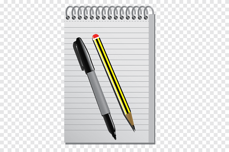
The best way to capture the idea is to write it down as soon as it appears, either on paper or in a notepad on your phone. These ideas can then be added to a mindmap.
There are a variety of tools you can use for this exercise, even the most rudimentary, paper and pencil. My favorite application for drawing a mind map is Mindmeister.
Imagine that the mind map is a representation of a spider's web, where the subject is in the Centre. Ideas start from the Centre and spread around.
Through a practical mindmap you organize your ideas… you create a map of them. You will have an overview of your project and with this organization you will notice that you can make groups of ideas. In the first phase, do a brain dump as they say, that is, write the ideas as they come to you, that they are good, that they are bad, it really doesn't matter.
Once you've cleared your mind of ideas, you can group them together. Some words can connect with others and this way you want to find other new ideas.
All disorganized thoughts will take shape and it will be much easier for you to formulate the concepts you are going to propose to the client.
02. Pencil and paper the best friends of the designer
A very good habit is to see the ideas on paper for the first time. The point is not to make things look nice. Not for nothing but you would waste a lot of time.
The goal is to communicate the essence of the ideas. What do you want to convey through them? You have the freedom to make mistakes, to erase and to erase pages and pages.
To get along. It's not about talent here.
If you've ever scrawled behind your notebook in maths or Romanian class, relax, you got this! An interesting thing is that this part of the sketch is very closely related to the mindmap and this is because from the mind map you can choose ideas to represent.
03. Use Adobe Illustrator, not Photoshop
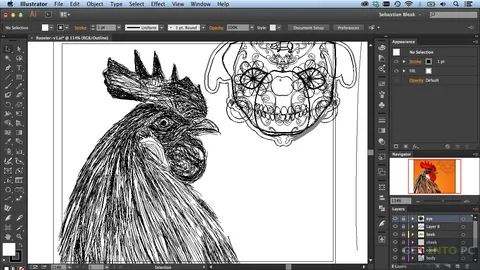
That's funny, I know. But it is a problem so common that it has become funny. Your logo design must be scalable, and that means it exists as a vector. If you follow the principle, "Well, I don't know Illustrator but I know Photoshop," my recommendation is to take your time and learn Illustrator. Photoshop = Pixel, Illustrator = Vector.
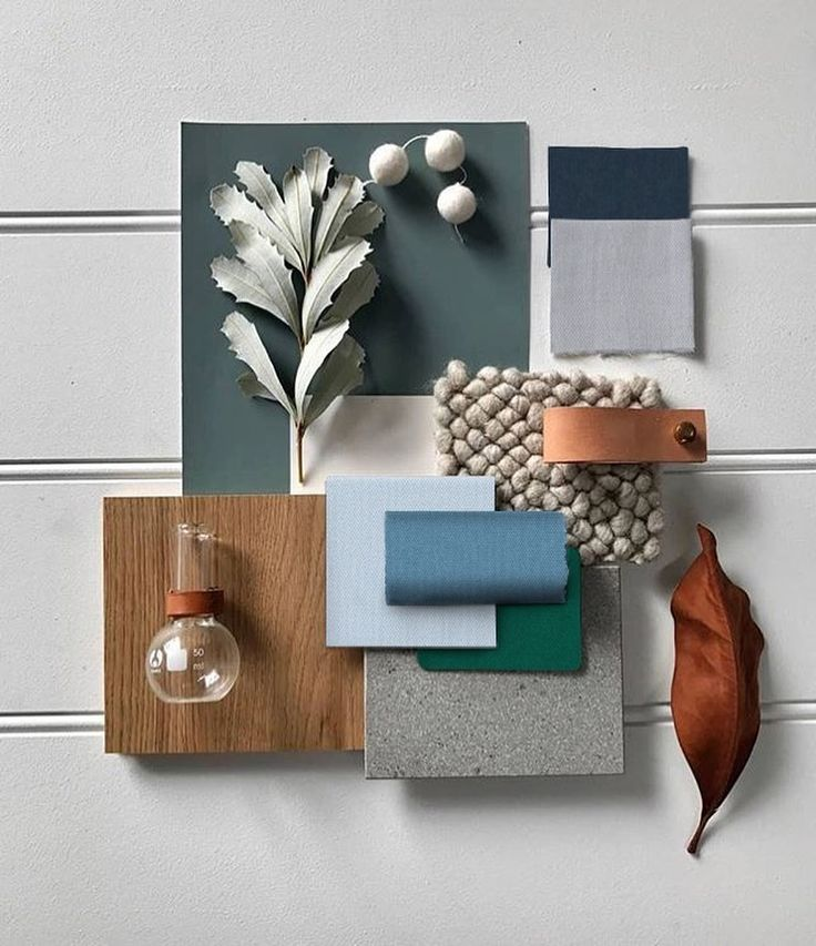
04. Create moodboards
Imagine this scenario: you invested a lot of time in developing your concepts, you made a presentation down to the smallest detail, and when you showed your work to the client he rejected it saying “it is far from what we need. I wanted". Sounds familiar, doesn't it? A designer goes through something like that. Unfortunately, there is no one-size-fits-all solution, but there are tools that can minimize the risk of rejection.
This moodboarding technique is very common in the creative industry, graphic design, UI, architecture, fashion, etc.
I like to think that moodboards are buckets to be filled with inspiration. You can fill this bucket with everything. In our case, with logos, images, fonts, textures, colors, just about anything. The purpose of mood boards is to convey the right mood and to bring to the surface the emotions that a visual identity, you would expect to convey.
Some of the tools I recommend for creating mood boards are, of course, Pinterest, Invision, Niice and GoMoodboards.
Moodboards can also be made collaboratively, together with the client or the team. It is very important to show something from the first moments and this is because our ideas and thoughts can be very confusing and the meaning of the words can differ from one person to another. You don't want to wake up saying "bold" and the client understands "bald" or vice versa.
Let's summarize a little.
Moodboards are a good way to gain the client's trust by involving them in the creative process. You practically minimize the risk of confusion, you explain the concepts through images and not just through words.
05. If you run out of ideas, don't force it. Take a break that you deserve.
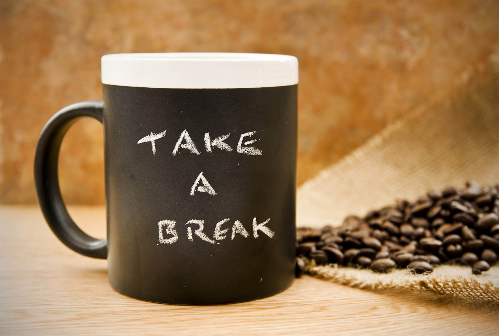
When you clear your mind of ideas, you might hit a wall and have a creative block. In fact, you no longer work in the normal parameters and you can't get anything good out of it. It's ok, it still happens and it's normal to be like that.
This is a clear sign that you have to go and do any activity that can disconnect you from work. You can listen to music, go for a walk, talk to colleagues in the office, or anyone else you might get free ideas.
After a well-deserved break, it remains to continue where you left off. If you still run out of ideas, go back to the mind map or moodboards. If you still run out of ideas, you can't go without ideas.
06. Size does NOT matter! Yeah Al that sounds pretty crap to me, Looks like BT aint for me either.

When creating a logo, you need to consider its adaptability. What the logo looks like in various situations and how well it can be scaled. The client could use it applied on all kinds of materials, from signage, application icon, even on a 16 × 16 pixel favicon. Pretty small. Think that your logo could exist in a horizontal and a vertical version for example, and depending on the situation you use one of the two.
07. Works in black and white
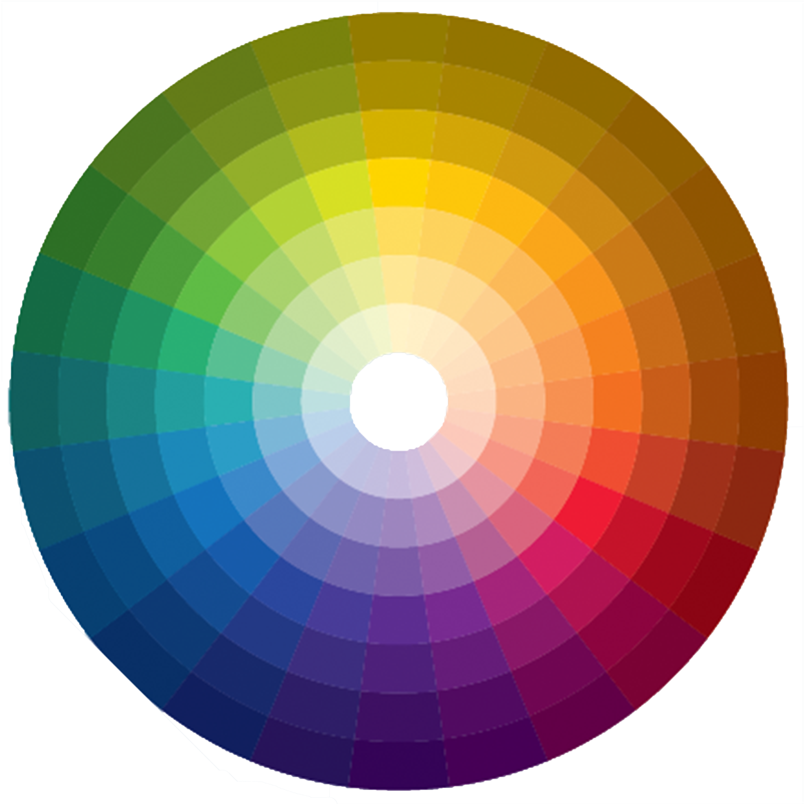
Exactly! The color is very subjective, so it would be better to leave it aside especially in the early stages of creation. A fairly common situation is when you ask for feedback and instead of receiving constructive criticism, you are rather charged because that green or pink candy is too strong, it is annoying and it does not fit well. So play safe, trust black and white, yin and yang, panda bears and zebra.
08. Reflects the logo
Whether you're working on a symbol or a text, or both, give it a horizontal or vertical flip. This way you will find any inconsistencies, problems with kerning where appropriate, but mainly you force your brain to see shapes.
09. Keep things simple, not simplistic
No extra mega complicates things. Not visually, but not as a story. The risk is to get into the cliché.
A boomerang that is actually a man and together with other people forms a four-leaf clover, which represents luck.
This is a simplistic / generic / cliché logo, and this is a simple logo.
I have often seen the attempt to explain too many concepts in one and it is wrong. Take a single concept and build around it. A logo must have a little mystery, and the rest of the explanations you can do by communicating the brand.
10. Is it logo design, branding?

There is a big difference between the two. Branding means the perception of others about your company, and logo design is a small part of the brand. Why do I say that? because many designers say they do branding, when in fact they only do logo design. I understand, the word digital branding sounds cool, so let's say the correct one.
Take Away:
You can be sure that the authentic graphic design platforms are already up to date with the mentioned tools and trends that you have just read. You are more than welcome to try any of these design trends, and your brand will come out with a vibrant and fresh look. Think about it and choose a leading Logo Design Company in Pakistan to get started.

Comments
Post a Comment